Recently Chris Packham tweeted that he was revisiting some old images, which inspired me to do the same. This exercise helped me during lockdown and demonstrated that what I considered to be a good photo when I first started in wildlife photography has changed. So, I thought I would share some of these images here and explain why revisiting your archive is a good idea and how to approach it if, like me, you have a lot to go through.
Seeing the light
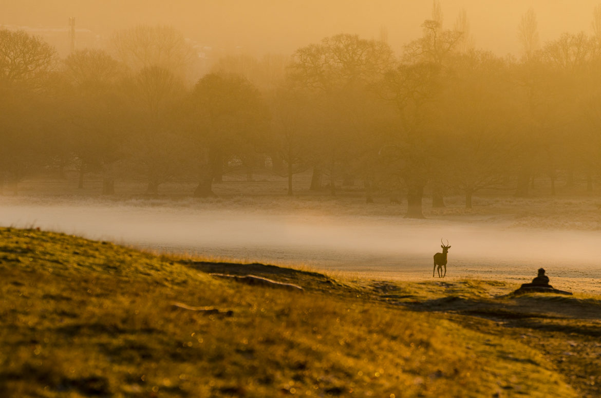
The first image I thought I’d share, which you can see above, was captured on a cold and frosty morning in December 2012. I know why I overlooked this one at the time. I hadn’t been on my wildlife photography journey that long and I was still labouring under the delusion that every image needed to show the subject large in the frame or be an interesting ‘animal in its environment’ photo. With that in mind, I was trying to build my fieldcraft to get as close to my subject as possible to fill the frame with a stunning wildlife portrait/behaviour/action shot.
However, when I revisited this folder of images a couple of months ago, the golden light in this one struck me. The young red deer buck is small in the frame and the landscape (the park) isn’t particularly attractive, but the light is incredible in the way it makes the frosty ground sparkle, highlights the side of the deer and emphasises the misty conditions. I should point out that this isn’t a heavily edited image either: the light is pretty much as it was in-camera with a bit of added contrast. I was thrilled to hear that Andy Rouse – the King of working with light – agreed with me (see below)!
So, when trawling through your archives look for unusual light conditions as you might be pleasantly surprised.
Appreciating the environment

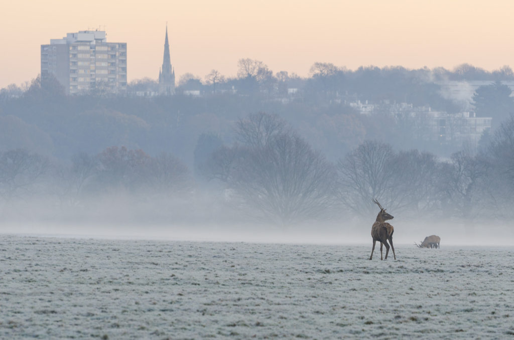
The second image I’m sharing was captured on the same cold and frosty morning in December 2012 as the image above. I also think I’d previously dismissed it for the same reason; it doesn’t show the animals large in the frame. I was also under the impression that an urban park setting would be less engaging as a backdrop than a remote and wild landscape.
However, when I revisited this folder of images taken in Richmond Park, I realised that I appreciate the high rise flats and church steeple that make up the background of this image. The hazy glow from the sunrise and misty conditions emphasise the wintry feel. As with the other image I shared from this set, this image didn’t need much editing in Lightroom.
It turns out that the landscape elements, which had caused me to skip over this image in the past, are actually what I like about it now. So, when searching through your archives, look for the interesting shots of animals in their environment you may have overlooked.
Reprocess to refresh

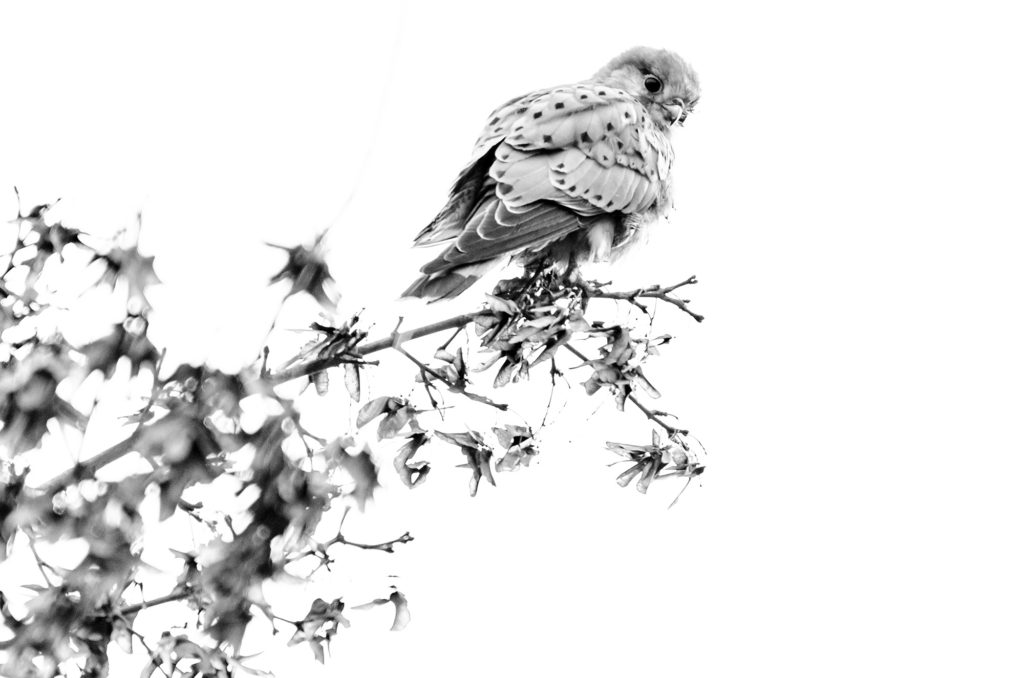
The third image I’m sharing was captured back in November 2015 and was a real “wildlife from my window” moment, so it felt appropriate to revisit this during the lockdown. It was more accurately a wildlife from my dad’s car window moment as we were pulling into the car park at the RSPB’s Fowlmere nature reserve when I spotted this kestrel perched at the top of a tree. It was quite a windy day, so this bird was getting buffeted by the wind and looked like it would take to the air at any moment. My dad stopped the car so that I could wind down the window and poke my lens out, but we were blocking the entrance and even if the kestrel didn’t fly off I knew we would probably have to move. So, I fired off a few shots without really having time to check my settings. I was shooting up at the tree with a flat and featureless sky behind the bird. The images captured in those few moments weren’t great – the kestrel was too dark, the angle was too harsh and the sky was too pale. I didn’t like them but kept them on my hard drive for some reason.
Revisiting these images in Lightroom, I decided I had nothing to lose by doing some serious editing. I decided to try making the images high-key by overexposing by three stops and then pushing up the highlights. I also increased the black levels to try to make the darker parts of the plumage pop.
I like the result. There are plenty of issues with it, but revisiting the images from this fleeting glimpse of a kestrel has taught me not to dismiss those images that I’m not immediately happy with or that aren’t conventional. I need to remind myself to take the ‘opposite view’ of my work!

